Hotel Priča

Creative direction Maša Vukmanović
Design Maša Vukmanović, Teo Drempetić Čonkić
Collaborators Jelena Lukač Kirš, Ivana Žalac (SKROZ)
Year 2015 – 2016
Client Franja obrt
Photography Ivan Dorotić
This is a small family hotel located in Rakov Potok, near Samobor. The hotel has six rooms, and the overall design is inspired by the surreal world of stories and fairy tales of Northwestern Croatia.
The hotel’s logo stems from a system of logos made for nine business entities of the client. Each dot of the logo symbolizes one of the entities, while the shape and color of the line encode the uniqueness of the hotel. The signage builds on this code and is consistently used for room identification and other hotel communication in the interior.
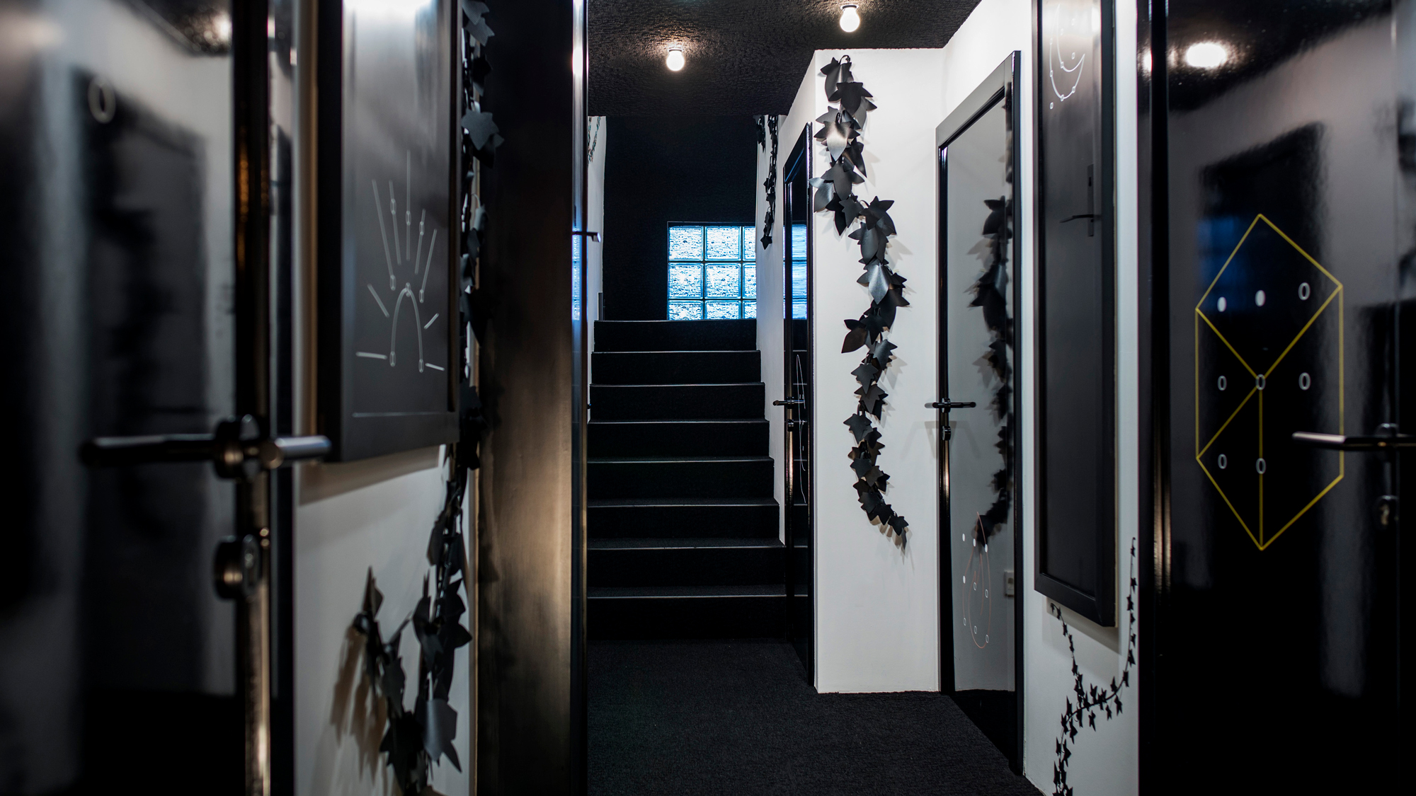
Given that each room tells its own story, different symbols have been added to them. Instead of Arabic numbers, a system with dots and a line is used. The line suggests the story that will unfold after opening the door. Thus, Thrush’s Nest room received a feather as a symbol, Meadow of Lights — stars, etc.
Depending on the story, different graphic materials were designed for each room, tailored in color and drawing: instructions, price lists, letters, poems, and key tags.
Apart from the entrances to the rooms, the hallway also contains 15 false doors of different sizes and orientations with a specific symbol and handle.


